Everything made by AI looks like the lobby of the 3rd worst casino.
-
Everything made by AI looks like the lobby of the 3rd worst casino. So deeply tacky.
Imagine the guy who hangs up one of those fake AI "schematic" drawings of a fictional spaceship on his wall. From a distance you get a little excited to look at the diagram and see all of the compartments and machine systems.
But, when you look more closely none of it makes sense. It's a fake impression of curiosity, creativity, imagination.
Plastic gold-plated pastiche of "I'm creative & have ideas"
I think the fact that it's tacky explains why it won't go away. Tacky stuff has always been around, there are always people who will tolerate, or even want tacky things.
(And for each of us there is something we like that someone who knows a bit more about that kind of object would find tacky. The concept is relative.)
I guess what's new with AI images is they can only ever be tacky. They can only ever be attempts to imitate something better.
-
I think the fact that it's tacky explains why it won't go away. Tacky stuff has always been around, there are always people who will tolerate, or even want tacky things.
(And for each of us there is something we like that someone who knows a bit more about that kind of object would find tacky. The concept is relative.)
I guess what's new with AI images is they can only ever be tacky. They can only ever be attempts to imitate something better.
When a person tries to make an image, most of the time the result is bad.
It could be technically incompetent, incomprehensible. AI has technical competence and is comprehensible in a general way. A drawing of a dog looks like a dog. The fur looks like fur. And everyone is so impressed with meeting this low bar because it's hard to do for artists.
But, once you get past that low level it all falls apart. It doesn't have any reason to exist except to exhibit stolen technical competence.
-
When a person tries to make an image, most of the time the result is bad.
It could be technically incompetent, incomprehensible. AI has technical competence and is comprehensible in a general way. A drawing of a dog looks like a dog. The fur looks like fur. And everyone is so impressed with meeting this low bar because it's hard to do for artists.
But, once you get past that low level it all falls apart. It doesn't have any reason to exist except to exhibit stolen technical competence.
And all of those impressions of competence are stolen. Take the fake Ghibli images. Ghibli uses these realistic muted color pallets. The AI copies use the same kind of colors together, it looks more sophisticated than when someone new to drawing attempts pick colors. The outlines are from another pallet, and simply using colored outlines on your drawing that better match the fill color can make them less cartoony and more realistic.
There are all of these technical tricks that make the style.
-
And all of those impressions of competence are stolen. Take the fake Ghibli images. Ghibli uses these realistic muted color pallets. The AI copies use the same kind of colors together, it looks more sophisticated than when someone new to drawing attempts pick colors. The outlines are from another pallet, and simply using colored outlines on your drawing that better match the fill color can make them less cartoony and more realistic.
There are all of these technical tricks that make the style.
But finding your way to using these techniques teaches you a lot about how your see the world... Just using a pre-packaged color pallet isn't the same as struggling to develop it yourself.
And in doing so you realize how light bounces off of everything, how that creates natural harmonies in the things you see with your eyes.
I remember realizing that the sidewalk in NYC on a bright day was really a very light shade of neon purple! I stopped using gray and used purple and it worked.
-
But finding your way to using these techniques teaches you a lot about how your see the world... Just using a pre-packaged color pallet isn't the same as struggling to develop it yourself.
And in doing so you realize how light bounces off of everything, how that creates natural harmonies in the things you see with your eyes.
I remember realizing that the sidewalk in NYC on a bright day was really a very light shade of neon purple! I stopped using gray and used purple and it worked.
But, part of why making the sidewalk purple worked was due to the orange deep red of the bricks in the buildings. A eyedropper on a photograph couldn't tell me this secret.
It's something the eye sees but a camera would miss.
And maybe I'll make an image someday that get reproduced so often it gets stuck in the pattern recognition of these systems. Where it'll be applied without any logic.
Or maybe I'll never make anything that popular. But, I still know that sidewalks are really purple.
-
 F myrmepropagandist shared this topic
-
But, part of why making the sidewalk purple worked was due to the orange deep red of the bricks in the buildings. A eyedropper on a photograph couldn't tell me this secret.
It's something the eye sees but a camera would miss.
And maybe I'll make an image someday that get reproduced so often it gets stuck in the pattern recognition of these systems. Where it'll be applied without any logic.
Or maybe I'll never make anything that popular. But, I still know that sidewalks are really purple.
I'm legit starting to hate "pretty" color pallets because of this.
When I see an image with nice contrasts, nice compliments and highlights just like when you see too many Christmas decorations too late in January it's off putting.
-
I'm legit starting to hate "pretty" color pallets because of this.
When I see an image with nice contrasts, nice compliments and highlights just like when you see too many Christmas decorations too late in January it's off putting.
My mom and I loved to drive around the leafy suburb where I grew up and be horribly judgmental about everyone’s Christmas decorations. We never decorated our house at all, so this counts as a vice I suppose.
But, it was interesting to compare year to year. In the late 80s multi-colored lights were a sign of deep moral decay. Real pine bows and gold-tone lights were correct. We argued about the merits of blinking vs. twinkling lights. I insisted only “slow wink” patterns were acceptable. 1/
-
My mom and I loved to drive around the leafy suburb where I grew up and be horribly judgmental about everyone’s Christmas decorations. We never decorated our house at all, so this counts as a vice I suppose.
But, it was interesting to compare year to year. In the late 80s multi-colored lights were a sign of deep moral decay. Real pine bows and gold-tone lights were correct. We argued about the merits of blinking vs. twinkling lights. I insisted only “slow wink” patterns were acceptable. 1/
For a few years I became convinced that string lights were unacceptable in *any* color. The only correct decoration: pine wreaths in each window & a single electric candle. I agonized over the matter of simulated candle flicker.
In the 90s blue “pulse” lights outlining the rooflines drove an aesthetic wedge between me and my mother— she was still not amused to see colored lights. I thought the effect (which made the houses look like 3D armatures) was so striking it justified the tackyness. 2/
-
For a few years I became convinced that string lights were unacceptable in *any* color. The only correct decoration: pine wreaths in each window & a single electric candle. I agonized over the matter of simulated candle flicker.
In the 90s blue “pulse” lights outlining the rooflines drove an aesthetic wedge between me and my mother— she was still not amused to see colored lights. I thought the effect (which made the houses look like 3D armatures) was so striking it justified the tackyness. 2/
Then a strange thing happened. In the 00s there was an inversion— a realignment of aesthetic camps. Suddenly understated golden lights were tacky— the very bulbous colorful lights we’d hated the most were “correct” — it was as if too many people got the memo about colorful lights being “out” now just having boring gold twinkle lights seemed lazy and ugly.
There is a point to this long story— that’s what AI is … the last one to catch on to every fad— but nonetheless chasing every fad. 3/3
-
For a few years I became convinced that string lights were unacceptable in *any* color. The only correct decoration: pine wreaths in each window & a single electric candle. I agonized over the matter of simulated candle flicker.
In the 90s blue “pulse” lights outlining the rooflines drove an aesthetic wedge between me and my mother— she was still not amused to see colored lights. I thought the effect (which made the houses look like 3D armatures) was so striking it justified the tackyness. 2/
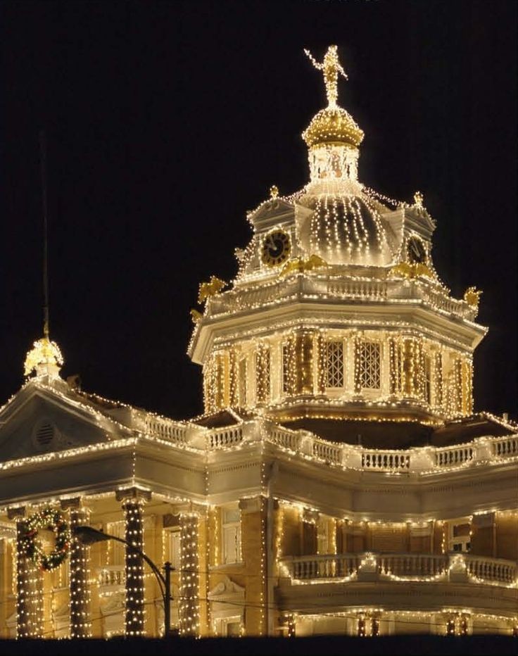
@futurebird very funny to read this because my family did the same thing of annual viewing and judging of other people's displays. I don't think we ever condemned string lights, it was representational art instead of abstract that attracted our derision. In particular I remember a house that had a huge plot of land and covered it with dozens of painted plywood standups, mostly of every Disney character imaginable. There was also a house with wire lighted sculptures of Elvis and associated imagery: a pink Cadillac, a hound dog, and so forth. The ideal decoration from our perspective was the courthouse in Marshall, Texas, which we visited every year because the civic display inspired lots of people in the city to try something ambitious themselves
-
But, part of why making the sidewalk purple worked was due to the orange deep red of the bricks in the buildings. A eyedropper on a photograph couldn't tell me this secret.
It's something the eye sees but a camera would miss.
And maybe I'll make an image someday that get reproduced so often it gets stuck in the pattern recognition of these systems. Where it'll be applied without any logic.
Or maybe I'll never make anything that popular. But, I still know that sidewalks are really purple.
@futurebird Are the sidewalks purple... or is the sky blue? Or are you sad? Or is natural light composed of blue wavelengths?
Rods and cones. The spectrum of visible light. Ambient light levels. Material. Adjacent material. All are technical factors which may influence the perception of color.
Theme. Emotion. Subject. Position. Conjunction. Contrast. All are human factors which may influence the perception of color.
-
Everything made by AI looks like the lobby of the 3rd worst casino. So deeply tacky.
Imagine the guy who hangs up one of those fake AI "schematic" drawings of a fictional spaceship on his wall. From a distance you get a little excited to look at the diagram and see all of the compartments and machine systems.
But, when you look more closely none of it makes sense. It's a fake impression of curiosity, creativity, imagination.
Plastic gold-plated pastiche of "I'm creative & have ideas"
I want to circle back and underline the concept of “the third worst casino” — I realize it would be easy to confuse this with the “third best casino” but it’s not that AI fails to be remarkable (but, most things that claim to be art do!) No, this is a deeper more disappointing mediocrity— “third worst” because in shabbiness and tawdry fakery it’s not even exemplary.
If it’s memorable at all it’s down to some unintentional uncanny quality— but, mostly it is aggressively forgettable.
-
When a person tries to make an image, most of the time the result is bad.
It could be technically incompetent, incomprehensible. AI has technical competence and is comprehensible in a general way. A drawing of a dog looks like a dog. The fur looks like fur. And everyone is so impressed with meeting this low bar because it's hard to do for artists.
But, once you get past that low level it all falls apart. It doesn't have any reason to exist except to exhibit stolen technical competence.
-
@futurebird as long as it can draw cute dogs that get people to buy whatever the cute dog is plastered on, the general public doesn’t seem to care much

 ️
️Yeah. But I do take some comfort in the fact that the only times an “AI artwork” has caused a buzz and gotten people excited has always been because the AI made some uncanny mistake.
There are people using AI to try to snag eyeballs with cute animals and sad children— but, is there *anyone* who sincerely has an AI image hung on their wall because it’s their favorite artwork? Because that one image really spoke to them?
-
@futurebird Are the sidewalks purple... or is the sky blue? Or are you sad? Or is natural light composed of blue wavelengths?
Rods and cones. The spectrum of visible light. Ambient light levels. Material. Adjacent material. All are technical factors which may influence the perception of color.
Theme. Emotion. Subject. Position. Conjunction. Contrast. All are human factors which may influence the perception of color.
@Wyatt_H_Knott @futurebird Been reading “Immense World” by Ed Yong and it’s such a good explainer of the senses . Including color.
-
@Wyatt_H_Knott @futurebird Been reading “Immense World” by Ed Yong and it’s such a good explainer of the senses . Including color.
@david @Wyatt_H_Knott @futurebird I love that book! Seconding the recommendation for this (and anything Ed Yong writes, really.)
-
@futurebird Are the sidewalks purple... or is the sky blue? Or are you sad? Or is natural light composed of blue wavelengths?
Rods and cones. The spectrum of visible light. Ambient light levels. Material. Adjacent material. All are technical factors which may influence the perception of color.
Theme. Emotion. Subject. Position. Conjunction. Contrast. All are human factors which may influence the perception of color.
Why do our brains put color in a circle when in terms of wavelengths when red has long wavelengths and blue has short ones? Seems sus.
-
@david @Wyatt_H_Knott @futurebird I love that book! Seconding the recommendation for this (and anything Ed Yong writes, really.)
@AnneOfGreenCables @david @Wyatt_H_Knott
I will third this recommendation of all the nonfiction I have read in the past 5 years it had the biggest impact— up there with “voyage of the beagle” for me personally—